Monday 23 December 2019

Monaco Nativity Scene

For Xmas I like to share some famous artworks while I'm on hiatus planning next year's themes so 


Nativity by Lorenzo Monaco 

Friday 20 December 2019

Saturday 7 December 2019

Classic Blue is Here

(I'm been VERY sick again hence the delays in posting)

#pantone #coloroftheyear #2020 #classicblue #design

SOOO WHO HAS SEEN #PANTONE 's #2020 Color #ClassicBlue !!!

It's an awesome powerful elegant choice that will play well with other colors and fit in with established color schemes. Neither Indigo or Ultramarine it is a rich deep middle blue with characteristics of both that should blend or dilute well.

here are the 3 best images I have found of it so far.


It can work with warm yellows oranges and some browns and light bright greens.

Ceramics will love it because of its similarity with cobalt blues. Painters will find it inspiring.
It should work well on a variety of textiles silk wool cotton . Then there's glass!

Well done Pantone. An excellent choice !


Tuesday 19 November 2019

Eroded Metal Inkscape Filter

This weeks #Inkscape #demo is the #erodedmetal #filter

I set teh letter color to a dark gray and then added Eroded Material

It looks more bashed or hammered than eroded on this font but it could be a good filter to use to create walls gates doors shields or armour in illustrations or logos for metalwork sculpture or rock music?

I may try this on a couple of more fonts and different colors. With dozens of fonts available sometimes it takes a while to find the perfect or pleasing match of font and filter. Experiment with combinations people! I'm thinking a red earthy tone might emulate rust?

As ever hoping my experiments inspire you to create something even better or truly awesome!

Tuesday 12 November 2019

Yes European Movable metal type is SPECIAL

#movable type #printing 

The uniqueness of Western Movable Type.

Yes the development of Movable Type is NOT unique to Western Europe.

Yes East Asia experimented with it too.

But No developing metal movable type does not make "Western Civilisation" superior !

BUT METAL TYPE IS SPECIAL.

WHY?

A unique combination of factors

A supply of paper for printing on.

A simple phonetic script with minimal symbols.

A market of readers and scholars needing personal copies of texts.

East Asia had all or most of those you say?

But Western Europe added on the final step of movable metal type.

And that market of readers and scholars was a MASS market.

There were limited print runs of luxury editions alongside of cheap religious texts and newsletters.

They had that elsewhere you say like Tokugawa Japan.

One final factor.

The alphabet.

Western movable metal type printing spread because of a common easily learned alphabet used all across Western Europe.

For Korean and Japanese printed Chinese characters were the prestige script. To combine them with hangul or kana ... woodblock printing was easier and cheaper especially in Japan though some parts of China were also book production centres.

The number of Chinese scholars who might have learnt kana or hangul or read Korean or Japanese books were limited but almost any five year old of can learn ABC.

Movable Metal type printing is special but if the Tokugawa regime hadn't kept such strict control over "dutch" learning or the Qing authorities have a strong cultural bias towards hand copying and calligraphy ...

This post is an expansion of some recent tweets posted on my @JVartndesign account


Tuesday 5 November 2019

A brief look at Merovingian

#merovingian #script #halfuncial

Merovingian script is NOT one of the high points of European script development and design.

Frankly it looks like some one at one monastic workshop taught his personal script to his students and it spread to other workshops until replaced by the Carolingian scripts. I also suspect whoever initialized this half uncial form was reacting against the ornate layouts and decoration of Irish books?

However I can see  elements or perhaps seeds within Merovingian style that later bloomed into something richer.


Merovingian has almost exaggerated ascenders and descenders compared to uncial or later scripts.


Also a love of "white space" ... king of the franks pippin 4 ...


and geometric grid based layouts


a limited color palette but some playfulness with initials


but that limited palette shows some Irish influence and moments of elegance


finally this delightful"kissing fish"  letter !


Saturday 26 October 2019

Inkscape Wireframe Sphere

Hey Folks sorry I don't post last week but doing tax and then a heat wave ...

#inkscape #demo #wireframe #sphere

Under the Extensions Submenu in Inkscape are some odd bits and pieces useful for generating geometrical shapes and diagrams


You can change the number of latitude and longitude lines and flatten a sphere but only a few other filters are useful. I've given 2 examples. Don't try changing the color the object will turn solid.

Monday 14 October 2019

A Renaissance Greek Gospel.

Can you name this famous edition of the Greek New Testament?
The country and city which it was designed and printed?
The printer and the designer of the Greek font?


No it is NOT from Venice !

The designer has a font named after him. 
The printer has a name that derives ultimately from the Greek for a wreath.

Saturday 28 September 2019

Inktober 2019

#inktober2019 #inktober

For INKTOBER 2019 I will be posting free and $1 works here on DeviantArt and my patreon

The $1 downloadables and rewards  will be larger screensavers


Tuesday 17 September 2019

Gimp Filters Cubism plus Embroidery

#Gimp #filters #cubism #embroidery
Take w plain red square created by selecting red as the color for a 512 px background layer

Add the Cubism filter


Nothing special 
How can we make it more interesting ?

I added embroidery


A much richer texture is the result 

Try this for yourself and remember you can edit cubist settings for different tile sizes !

upcoming schedule change

posting schedule for glyphika will change due to upcoming medical and physio appointments september 2019

Saturday 14 September 2019

Sketch september


Why no support for mobile app

Is anyone else disappointed that instead of fixing the Blogger  app we are being told to use a browser to  post images when we're on a mobile to our blogs whether its in the phone gallery or google drive we have to log in via a browser
I want to be able to do this on a mobile so I dont have to transfer images from my mobile to my laptop and I don't want to be carrying my laptop around

Sunday 8 September 2019

Inkscape Demo - Tartan

#INKSCAPE #DEMO - #TARTAN #FILTER

There are 3 filters for creating Tartan patterns in the Overlay Sub Menu


I'll be posting more Tartan Patterns and also since its #sketchseptember maybe some drawings 

Sunday 1 September 2019

FIVE INKSCAPE FILTERS

#inkscape #demo #filter

FIVE INKSCAPE FILTERS that can transform a plain object


Sunday 25 August 2019

Inkscape Demo - Sharp Deco

#inkscape #demo #filter #sharpdeco


I had never tested the Sharp Deco filter before and was pleasantly startled to get this result when the filter was applied over a plain blue square.  I'm thinking this could be good for text  frames or maybe tiled to form windows panes or panels in a game if you flip the objects around ?

Sunday 18 August 2019

AUGUSTUS and TYPOGRAPHY

Its #August So Let's look at #Roman #typography of the #Augustan era

The Romans were keen on public inscriptions and the Augustan era saw a building boom which left lots of them to study. Some recorded information others were propaganda.

Here are 3 examples to study which mention Augustus. The V was used for both U and V.


Which modern fonts were inspired or developed from these?

Did some master scribe carefully do a layout on papyrus or parchment for the masons to copy?

Saturday 10 August 2019

Screen savers

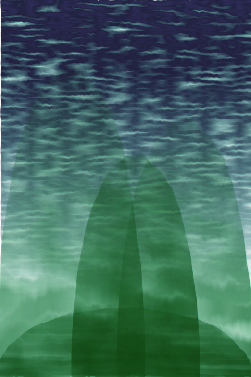
Hey people can I have some feedback on the screen savers Ive been doing the last couple of months?
Yes I know some are in the $1 tier on my Patreon but others were free or viewable on Patreon or my DeviantArt

Saturday 3 August 2019

Ridge Rings Demo

#inkscape #demo #filter #Ridges

Want to make rings for an illustration - try this method - it doesnt have to be blue - othe rcolors will work - you might want to play with the drop shadow depending on what background you plan to use ?


Sunday 21 July 2019

Fractal Fabric

#gimp #fractals  #coloredit
Asemi demo of how to change a fractal to a less digital looking texture


so in Gimp I generated this pattern but it has little specks of green so I went to the Color Tools and turned green down and I also altered the Brightness and Contrast


then finally I decided to remove the last of the blue and apply a Gimp texture filter from the Impressionist submenu


Now it looks like batik or tapestry 

I may add this to my Patreon as a freesaver 


Saturday 13 July 2019

About Digital Delights

About #DigitalDelights

People Please Share my #JVartNdesign #Patreon

Yes I have a Patreon


There are Freebies 2 $1 tiers and a $5 Access Everything Tier !
Its per Month not Per creation and what do you get?

Abstracts Poem Cards Backgrounds Prints Textures Posters Technozi and NEW Images in Screen saver formats YES SCREENSAVERS


If you're learnt from or enjoyed anything posted on this blog think about rewarding yourself and me by pledging to my


Patreon 

Sunday 7 July 2019

Two Bevel Borders - Inkscape Demo

#inkscape #filter #demo #bevel

Continuing the ABC of #Inkscapefilters here are 2 from the Bevel section starting with R
#raisedborder and #ridgedborder


Please let me know if you have found these demos useful ?

Sunday 30 June 2019

Inkscapes Pointillism Filter - Dark Sky and Sun

Another post in my ABC exploration of Various Inkscape Filters !

#Inkscape has a #pointillism #filter in the #Distort menu.

Here's my experiment with it. I generated an Oblong and filled it with a very dark blue black and then applied the Pointillism Filter and then a gradient. This make me think of starry skies and wonder if it could be useful for science illustrations. Yes you would have to crop the edges but ...


You can see the possibilities to create a low resolution background thats not a memory hog and add edits and layers and objects? You don't have to have the sun. I'm also thinking you can flip the gradient around and have a starry sky BG and a blank area you can use for a foreground or higher layer? Another usage might be exporting to Gimp and applying the Supernova Filter ?

Sunday 23 June 2019

The Handmaid's Tale

I'm taking  break from the ABC Demos to finish off #patreon rewards including this


well in a way its still an #inkscape #demo of how useful Inkscape is for a variety of purposes.

My ART #patreon is https://www.patreon.com/JVartndesign


Sunday 16 June 2019

Oil Painting Filter in Inkscape

#OilPainting #filter #inkscape

Continuing my ABC order exploration of #inkscape #filters!


MMM this might be useful for illustrations if you want to suggest somehow letters have become blurred or soften shapes to suggest a distant view ?  I also tried this over a gradient and a solid color and can't see much difference. Don't even think of trying it over anything but an ultra expanded or super heavy font. I tried 3 different fonts and the letters blurred and faded so much the demos were not ...instructive ... use with caution.

Sunday 9 June 2019

Neon Filter Demo - Inkscape

Here's a demo using #Inkscape of the #Neon #filter which is in the #Bevels section


I've given the 6 rather basic web safe colors a neutral gray background but you should experiment with other colors for text and background !

The #font is #Bauhaus

Thursday 30 May 2019

My new Patreon header !

What do you think of this?

its my new header for https://www.patreon.com/JVartndesign

METAL !!!

There are 2 #inkscape #filters that provide strong metal effects.

One from the Bevels submenu and another from Materials.
Can you guess which?

I like textures so striking as the Raised lettering is I recommend Eroded Metal as a filter as withe raised ones one usually has to strengthen the Stroke to counterbalance the highlights

With both you have to consider what background colors will be used.


Thursday 23 May 2019

Patreon rewards for May

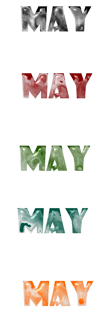
Yes Ive been busy getting Patreon rewards for May ready and  up

Hey folks my birthdays next week n I ld lv to hv at least 10 more pledges for

Https://www.patreon.com/JVartndesign

Saturday 11 May 2019

MAY and 3D Marble

#3Dmarblefilter #inkscape #filterdemo #inkscapefilters #may

#D Marble is an Inkscape Materials #filter that can produce stone like effects. I would recommend a wide bold heavy font and testings a variety of darker colors.


I used darker tones to try to make the final  effect a bit more natural owing for the highlights that suggest polished stone. I type the word stone because depending on the colors one could get granite or green green or a paler near white.

Sunday 5 May 2019

Tagging Haiku Art or Digital Haiku?

#digitalhaiku #haikuart #haiku #illustration #inkscape

I'm trying to figure what are the best tags for my recent series of works inspired by HAIKU

Would anyone care to suggest tags ?

Kasumi
Copyright J. Vaux 2019
This was inspired by a poem about sunset and evening mists descending upon mountains and hills.

A larger high resolution version is available from #redbubble


Saturday 27 April 2019

Leaves and Layers

Getting back to the ABC of #Inkscape series here's a background file
This is not the full size I will upload it to my DeviantArt as well


I generated a SVG object with the rectangle tool and added a gradient and then another layer with gradient and both layers had the Scatter leaver filter applied but in different tonal patterns.


Saturday 20 April 2019

EASTER ART - Dieric Bouts

For #Easter and Christmas I like to draw your attention to a relevant piece of European art if I had no ideas for e-cards so this year something Flemish and Northern.


This is by Dieric Bouts founder of the Louvain school. Note the contrasts of red and white against the pale dawn colors. The road leading our eyes towards the sunrise. The  grays and greens. The grace and power. The exquisite draperies. The quietly confident Christ stepping forth.

Saturday 13 April 2019

After Chaos

I can't find a filter I like starting with L so I may have to skip a few letters in my #Inkscape filters ABC sequence but here's something else that shows how #choas is #related to #complexity and vice versa

This was made with #gimp


#turbulence no pattern yet but lets add #smalltiles


patterns begin to appear from random pixels so next some cut and paste and rotating and flipping etc


We have a pattern but its kinda gaudy and glarish so color and texture edits 


definitely better but could be even better


less texture more dark tones for contrast or I can change the colors again


either of these last two tiled or enlarged should work for my #redbubble shop or as a screensaver maybe  I'll use both variants?

Oh I'm thinking for doing some screensavers for my patreon too

Send feedback would you like this as a #Patreon reward or a #Redbubble product ?


Thursday 4 April 2019

Some thoughts on Hiragana

Normally this would go in my #Technozi blog and I may well repost it there but I'm here because I want to share some observations and speculations about #hiragana.

Now many textbooks note in a general way that the  Hiragana #syllabary sysyem was developed from cursive forms of #kanji but how ?


This diagram shows the kanji at top the cursive form in red and then the hiragana
Lexicographers not being calligraphers or typographic designers don't comment on HOW elegant the process of developing simple forms is !

And the influence of media on form. Hiragana was primarily a script to be used with a BRUSH and written top to bottom and right to left in columns.

HI which is 4 strokes in Kanji becomes one continuous curve likewise Ni and Shi and others

but there seems to have an element of deliberate design too for angular NAI becomes one form NO  too!

Traditionally men learnt kanji and kana and used both but hiragana was associated with women

WHY

One of the reasons for the development of kana was explaining and recording sounds both for those learning Japanese and Chinese.

While there was probably several generations of scribes and scholars involved in its development I wonder if at one stage some frustrated woman fed up with having to sneak into a male relatives study and wanting to share what she had learnt with other women played a role in simplifying the forms further?

Whoever worked on the development of hiragana somewhere someone who had studied both kaishu and the cursive scripts was part of a team and given they opted for a syllabic system probably Buddhists familiar with Sanskrit were consulted. Some Japanese Buddhists use a form of written Sanskrit script that can be brushed.

There are no stories claiming one person created hiragana so I think it was a group of experts and interested amateurs over a few generations. Happily for the Japanese they had an eye for form.

The system matched Japanese sounds so well only a few have dropped out of usage because the sounds they represent are not used in modern speech.

A few symbols have been added such as the side stroke used  to mark the differences between ka and ga or s and zo sounds and the symbol used to indicate a final nasal in a syllable but over all given hiragana's been in use for nearly 1500 years ... think about that and consider the differences between the earliest Greek and Roman alphabets and modern Roman ABC scripts and letter forms !

Thursday 28 March 2019

JAM SPREAD Filter

Yes another #inkscape #demo this time the #jamspread #filter


The filter was applied over plain squares of color. I would suggest testing it over textured layers or tiling squares or other shapes for larger areas? With some further editing I could see them being useful for suggesting turbulent fluids or a wet surface? Another experiment could be using the filter over a gradient. 

Next time K is for ... or I might just show some digital painting I've done this month.