A blog about Signs Fonts Typography Design Scripts Calligraphy Symbols etc,.
Thursday 31 December 2020
Xmas Freebies 2020
Hi people did you remember to visit n download freebies from my https://www.patreon.com/JVartndesign
Thursday 24 December 2020

Tuesday 22 December 2020

Saturday 19 December 2020

Wednesday 16 December 2020
Followers Xmas Freebies
For a fabulous mix of FREE and open to all patreons screensavers ecards n ebooks Visit
My #patreon Https://www.patreon.com/JVARTNDESIGN

Monday 7 December 2020
Early Renaissance Night Scene
Its December which means Christmas pictures ! But you know I try to find something different.
This Taddeo painting shows the Angels speaking to the Shepherds by night.

Bear in mind looking at this that it is not an oil painting. The artist had to get the tones down in one session with no over painting. Yet given this is an early renaissance work note the tones suggesting an unearthly heavenly light and the details including the dog the herders cudgel the other herder shading his eyes from the sudden light and despite this being a night scene the dark sky rendered with very little use of black . In fact there's more black on the sheep!
Monday 30 November 2020
the angle of W
I promised you some more nib images

This is from an old speedball manual I own
The C-0 is a reference to a type of nib
I have a few more of these to share
Tuesday 24 November 2020
Carolingian Manual Layout
CAROLINGIAN LAYOUT
This image from a Carolingian manuscript caught my attention due to its layout.
This is from an era with no concept of type setting. The letters were written on paper.
You can see traces of ruled lines on the page since they didnt have the option of deleting bottom layers or grids that can be turned on and off. This is also perhaps tells us this was a copy for reading not display. The spacing between lines would also be useful for interlineal notes.

There are a few errors Sed intra looks like one word.
The spacings between sentences are not consistent and it looks as if the scribe was thinking too much about where to put the full stops?
Overall however its quite readable and those variances remember us of the differences between handwritten and printed documents and hte advantages for final edits of a computer?
Perhaps just for practice and after checking the modern Latin forms try typesetting this in a word processing program? Then study the differences?
Thursday 19 November 2020
Nibs n Angles
NIBS AND ANGLES
Detachable metal shaped fibre tip pressure sensitive etc


This is a cropped shot of part of a page from a calligraphy manual in my reference collection
Anyway note the 45 degree angle to the page
Depending on what program you use you may have to change an angle setting to get the most effective result ?
Why worry if you're using digital ?
What if a work requires an image of say a page of a handwritten manuscript or you're creating fonts?
Its worthwhile to check out older calligraphy manuals that illustrate pen angles
I have more images to share over the next few posts
Follow me n get updates
Friday 13 November 2020
The First Glyphs
THE FIRST GLYPHS
#glyphs #hieroglyphs #egyptianwriting #earlywriting

For thousands of years the mode of writing for literate societies was based on pictograms or ideographs with sound being a secondary consideration.
The example above is one of the oldest of not the lowest examples of Egyptian (hiero)glyphs.
Glyphs symbols were carved stratched engraved into clay or rock or onto tortoise shells or bones!
For contrast here's an example of "Oracle Bone" with the modern kaishu forms

Egyptian hieroglyphs can be generated with a computer for specialized usage and so can Sinitic based characters however Sinitic characters whether its kaishu have a wider and far longer usage, perhaps because the Chinese created compound characters with one part of the character being a hint to the pronunciation.
However both Egyptian and Chinese glyphs have had to compete with alphabetic systems.
In the case of Egyptian with Greek and Arabic and in China pinyin Chinese written with Roman letters is taught along with characters to introduce students to the concept of an ABC.
SOUND VERSUS SYMBOL
and sound won?
Wednesday 11 November 2020
Why is this Martian STILL annoyed?
#martianmanhunter #dcumovies #jla
The post below is 3 years old - Every issue I mentioned is still relevant!
When are we going to see the Martian Manhunter either on TV again or in a movie?
NEVER !?
Why is this Martian Angry? Well grumpy and serious like he hasnt had his OREO fix !
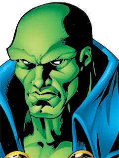


Read on there is a design angle!

One thing that really annoys me about the JLA movie apart from the overusage of CGI is the TOTAL absense and NOT even a brief mention of a founding JLA member the Martian Manhunter!

DC you are missing out on a Golden Opportunity to support some great design work!
Now the Manhunter is currently on TV in Supergirl but I for one would love to see him have a whole movie or TV series of his own.
He's a shapeshifter so you could have several actors playing the part or as episode guests and actors of multiple ethnicities. Its canon in most recent versions John Jones is not his only human identity.
Now for some of the design opportunities and challenges for the character.
Costume should they go for the original 50s version or full body costume to reduce makeup time?
SFX and CGI
flashbacks to Mars
flashbacks to Erdels 50s style science lab
showing alternate Martian forms the avian or the green "elf" look.
using his invisibility powers
doing partial transformations
Seriously DC please do the Martian Manhunter!

Make this Martian Happy!
Tuesday 10 November 2020
Martin of Tours and Carolingian Script
#Stmartin #martinmas #carolingianscript
Today is Martinmas November the 11th also Remembrance Day in several countries.
Now Martin of Tours was a Roman Soldier who became Bishop of Tours and one of the most famous examples of Carolingian Script is a manuscript with the biography of this saint written by Gregory of Tours.

Excellent crisp letter forms of ink on parchment not paper showing why so called half uncial scripts were popular for so many centuries in Western Europe and still influence font design today.
Very obviously handwritten and not printed though with the spacing between words and letters and the size changing here and there as if the scribe hestitated thinking about how to fit the text onto the page.
Compare this to a Carolingian based font and consider the advantages of typography via a computer to the calligraghy of a scribe.
Yet which was more personality or beauty ?
Thursday 29 October 2020
Black Base Demo B - Black Under Red
#black #base #layer #inkscape #demo
This demo shows how black as a base layer under red plus filters works in comparision to not having an underlayer.
Even under a really "thick" materials filter like Cracked lava there's a clear difference!
Under a semi- transparent filter like Tartan the reds are intensified.

Try it for yourself with a variety of filters!
Friday 23 October 2020
Inktober Black Matte Demo
Inktober Black Matte Demo
#inkscape #filter #demo #Matte

I've taken one oblong filled with black and applied five different filters to create matte effects.
This time I'm not telling you which. I want you to experiment and practise.
There will be a few more of these!
Tuesday 20 October 2020
Inktober and Black - Using a Black Base Layer with Blue
#inktober #black #inkscape #demo
More about Black
Using A Black Base Layer with Blue
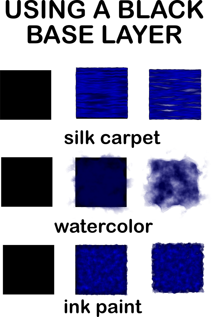
Why use a black base layer ?
I started with black and blue squares and added 3 different texture filters to the blue squares using #Inkscape. I hope your browser allows you to see how the black base layer creates depth in the squares in the middle column? I made duplicates of the blue texture squares and moved them over copies of the black squares. Of course you don't have to use squares or these texture filters but I hope this gives you ideas for your own work? You could also do further edits in Gimp or other programs.
Thursday 15 October 2020
More thoughts on Black and Inkscape
#inkscape #black #inktober
In this demo I show how starting with a Black or dark gray layer in Inkscape can change the layer above
The left column is the base layer
middle column of squares is a blend
right column a "purer" color
How powerful black is !

Monday 12 October 2020
INktober - thoughts on Black
#black #color #inktober
ITs Inktober again so let us consider the role of black.

I'ld like you to think about this old 19th German diagram not co sits OLD
but cos its STILL RELEVANT.
Whoever created it thought about transitions and gradients from white to black and vice versa and how black darkens other colors.
Here's another example the power of black to change colors from one of my older Inkscape demos.

For each row I shifted the colors further toward black.
There will be more discussion and demos of black and Ink throughout this month .
Folks I just lost my job !
Please consider supporting my Patreon
or using the paypal tip jar ???
.
Tuesday 29 September 2020
Working on Ideas for I and Zero
Working on Ideas for I and Zero.
Its #Inktober soon and I have been sketching some ideas for inktober logos and also for ways to make ZERO more than just a modified O

I started with pencil roughs and then I went over the outlines with an .4 Artline feltip

Next I will either tidy them up with Gimp or Procreate or Inkscape.
I might trace over them or look for a font with a shape similar to my sketches and use filters to modify the form until its like my sketch but better. Another issue is whether to make them solid black or stay with outlines or use heavier outlines. I'll show you some more sketches over the next month.
Saturday 26 September 2020
ENSO for Inktober
One thing you might want to consider for #inktober is doing #Enso.
These circles of #ink on paper are excellent brush practice for calligraphers and painters and if you do a particularly fine one you can use it for contemplation as it is a symbol not just of enlightenment but also of MU.
I have some done digitally up on my Patreon JVartndesign if you'ld like to check them?

This one was done by Hakuin a Japanese Zen Master. Note how the ink has soaked into the paper giving a simple circular brush stroke texture and depth. Try some for yourself. Any thick paper. If you don't have Asian brushes use a brush tip marker or a watercolor brush with a long tapering point.
If you don't have actual ink its fine if you want to use paint instead!
Just have fun and practice! Let the ink flow !
Tuesday 22 September 2020

Saturday 19 September 2020
Inktober Soon
This is the initial pencil sketch
I will post each stage as I refi n e and finish this design!
Copyright J. Vaux 2020

Sunday 13 September 2020
Roman Numerals in the Middle Ages in Europe.
Roman Numerals in the Middle Ages in Europe. An Example.
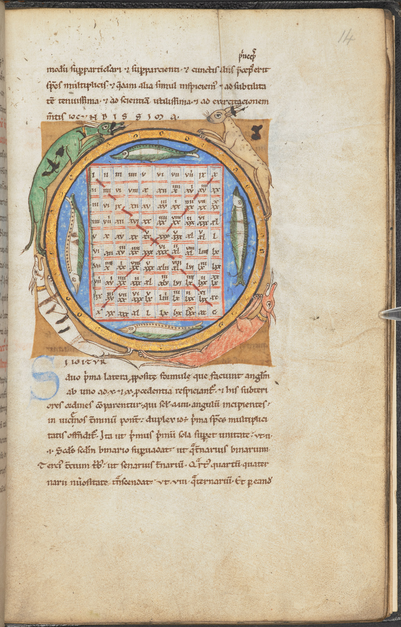
Religious manuscripts frankly outnumber secular manuscripts but I wanted to use this image while I'm thinking about typography and number to remind people how long roman numerals persisted.
You may see numbers in modern "Gothic" fonts but until the Renaissance and beyond Roman numerals were still quite commonly used in inscriptions and paintings and illustrations.
This may be partly because the basic maths text for many centuries was Euclids Elements in a LATIN translation yet ironic both Latin and Greek used an acrophonic system to write numbers.
And why when 10 starts with a D in both Latin and Greek we switched to the Roman practice of writing 10 as an X is a mystery when the Romans sensibly used C for Centum 100?
Wednesday 9 September 2020
The curious case of Zero
THE CURIOUS CASE OF ZERO.

This is the Gwalior Inscription from India which has the oldest known example of ZERO.
There are other inscriptions from various cultures in which zero is represented by a blank space or a dot but the Indians were the first to use zero as part of a number system consistently.

Their use rapidly spread across Asia and North Africa and reached Europe via the happy accident of an certain Italian Mathematician visiting Algeria and discovered their use.
This is what Fibonacci wrote about them.

Roughly translated from the Latin Nine figures of india ... sign ) that arabs call zephir
Zephir contracted in popular usage to our modern zero.
However a point who else has noticed when typographers design fonts they don't always give as much attention to the numbers as the letters?
This is 0 on my keyboard.
This is O
0 - O
About the only difference in most fonts and calligraphy manuals too is that the 0 is narrower?
Saturday 5 September 2020
DIVERSE MONGOLIAN !
One of the many reasons we should support #savemongolianlanguage is the diverse responses Mongolians calligraphers and scholars have made over the centuries to continue to found and develop the best forms of script to represent Mongolian a Ural-Altaic language.

Yes that many! Modified Tibetan and Old Uighur! Square styles. Cursive styles. Using Cyrillic or European alphabets. But always experimenting to change letter forms to match Mongolian not change Mongolian to match other scripts. Or force instruction in other languages.
One scribe even created Galik an script variant designed to be able to use Mongolian letters to write Mongolian, Sanskrit, Tibetan and Chinese!
Perhaps Chinese education bureacrats should consider teaching Mongolian script to local Han settlers ?

Mongolian is also unique in being the only vertical script that unlike Hangul, kana, or Sinitic characters, runs top to bottom and left to right.
Monday 31 August 2020
Augustine - Illumined Manuscript
Augustine for August. For some reason the makers of this Gospel of Luke decided Augustine would be a suitable image although he was a theologian not an Apostle.


It shows Agustine holding a codex not a scroll but he clearly has Roman costume and classical columns form the frame for the images of the Saint.
Oddly Classical in its details despite being Post Classical.
Thursday 27 August 2020
Dragon on a Signboard - Layout example
Dragon on a signboard

I am sharing this as an example of layout problems. This is no Kano masterpiece just a simple signboard at a Japanese temple. Note however the artist has fitted the composition to the shape of the board with the writing forming a frame.

I am sharing this as an example of layout problems. This is no Kano masterpiece just a simple signboard at a Japanese temple. Note however the artist has fitted the composition to the shape of the board with the writing forming a frame.
Sunday 23 August 2020
Another Medley of Dragons.
Another Medley of Dragons in various media .

Islamic Manuscript on Astrology / Astronomy

Chinese Lacquer

A Korean Vase Note how the dragon curves around the vase.

Saturday 15 August 2020
More Dragons
#dragons#illuminedmanuscripts
MORE DRAGONS
Lets start with the famous Hartley Dragon which is also an example of text boxs frames and breaking the frame !


MORE DRAGONS
Lets start with the famous Hartley Dragon which is also an example of text boxs frames and breaking the frame !


A Dragon Slayer showing a generous usage of ultramarine blue
from a few centuries later the story of Vortigern and the Dragons!

and finally back to the carolingian era
enjoy both the crisp clear lettering and the image of the dragon standard and note how over the centuries as styles changed the ratio and layout of text to image also changes ?
Saturday 8 August 2020
Dragons A Medley.
#dragons #medley
Dragons A Medley
 Dragons appear in and on a wide variety of media and in art from across Eurasia West to East.
The first image is a notice board at a Japanese temple. The Second one is a sculpture from Galicia in Northern Spain.
Dragons A Medley

The first image is a notice board at a Japanese temple. The Second one is a sculpture from Galicia in Northern Spain.

and also in Persian manuscripts

Thursday 6 August 2020
this months theme
AuGUST 2020
This months theme is dragons but Im still finishing off my search for images
Be patient
GIBBERISH
Is it wearable art or word play?
What do you think ?
You can view this design with different background colors and styles at
What do you think ?
You can view this design with different background colors and styles at
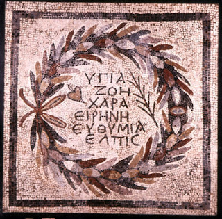
An Color Edit Example
Color Editing Mosaics.
I'll like you to help with a comparision.
The first image just had one simple crop and tidy up of edges.
The Second I did color and tone edits on to try to be back to how I suspect the original mosaic looked before weathering and erosion etc .
Is there a difference or not?
Here's the first version.

I'll like you to help with a comparision.
The first image just had one simple crop and tidy up of edges.
The Second I did color and tone edits on to try to be back to how I suspect the original mosaic looked before weathering and erosion etc .
Is there a difference or not?
Here's the first version.
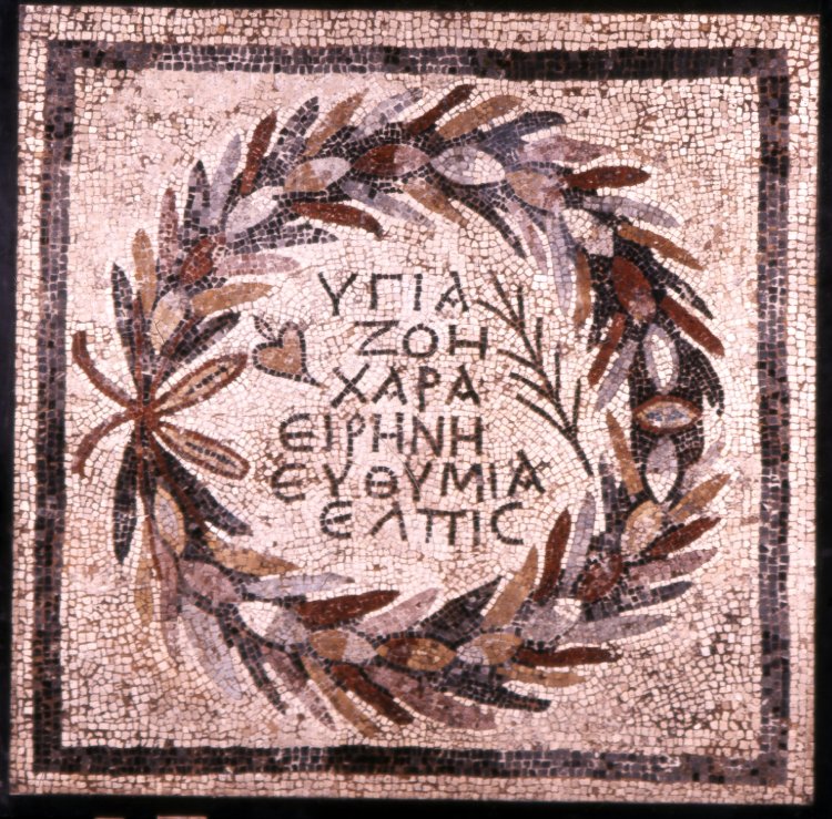
and now the second with more edits!

What do you think?
Next time I'll be discussing the use of mosaic filters in Gimp and how I edited letter shapes to get forms that would work the best with that filter.
Oh and yes I did tweak both the reds and blues for this using the Color Tool to deepen shadows and strengthen highlights and mid tones I HOPE ???
Wednesday 22 July 2020
Last Julys Patreon Rewards
These rewards from last year will be deleted or moved to my DeviantArt soon.


Last chance to get them ! All of these were made with Gimp.


A screensaver pattern 4 - 3 ratio

Another screensaver pattern inspired by aerial photography

One of my better attempts at using Gimp for digital painting
Crafted on a laptop fingers on a touch pad and filters and textured airbrush and supernova
Subscribe to:
Posts (Atom)