Hand still recovering but here's a card

A blog about Signs Fonts Typography Design Scripts Calligraphy Symbols etc,.

#christmas #ecard #humour #irony #xmas

#november #2021 Headers
This is goin up on my Patreon
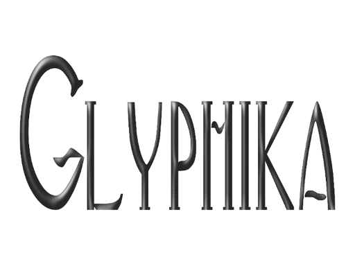
Isn't it wonderful what you can do in #inkscape with one word many fonts and filters !

#remembranceday #November11
It's coming
11-11-11
Who else is working on
Remembrance / Veterans / Armistice ?
Here's two of my older works !


#ruisdael #etching #landscape
I hope these educational posts are helpful even if its just saving any of my followers or visitors time scrolling thru Google Image Search? Let me if it helped. I wasnt at work today so I got to catch up scheduling the posts but I may have to put this blog on hiatus closer to Christmas.
I don't have enough followers or Adsense income to make this a full time job so let me know has this blog helped even if just giving you something to enjoy looking at?

This is Hessel Gerritsz ' Etching of Summer Aetas. It caugh my eye because it reminded me of the some of the Summer theme illumined mansucripts I was looking at earlier this year and last year especially some by simon Bening.
Gerritsz was one of those artists also notorious for copying other works and for perhaps being too productive and profiting from the interest in prints from the middle classes of the Netherlands who could not afford to commission paintings but wanted artworks for their homes.
Inktober
Perhaps the most famous example of a Print that is also a Drawing directly onto the Tablet is Rembrandt's Three Trees which combines Etching Engraving and Drypoint in one work.

Before there were Prints and Tablets and Internet the drawing tablet was often a plate of copper or iron for etching and engraving as well as wooden engravings.
One of the most noted early Netherlandish engravers was Pieter Breughul the Older who before he shifted back to the paintings he is famous for spent about a decade being known for drawings and engravings.
This one is a drawing but it is very typical of his engraving style as he seems to have done drawings copied by others onto engraving plates and this particular drawing shows the the influence of Bosch.

The work is called Desidia - Sloth in English.
Many of the painters of the 17th century Dutch "Golden Age" were also printmakers or created drawings copied for prints. The similarity of his drawing style to his paintings suggest strongly that Jacob Ruisdael drawn onto the etching plate himself.

House by a Little Bridge Jacob Ruisdael - more "linear" than Rembrandt.


A test. Do you know what this symbol is?
It's a sibilant and a fricative but which one?

#ipa #symbols #sibilants
These are the most common
IPA and other SYMBOLS for SIBILANTS
s ʃ ś ş š ɕ ʂ
generally written as s or sh or with one of the diacritics shown.
I will be posting this as a pdf on my metousia patreon soon.
THE ANCETOR OF S
The theme for the rest of this month is the letter S

#bilingultext #early print book #german #latin
Here's another example of an early printed book with bilingual text. The coloring may have been added by hand or by woodblocks over the printing.

#psalter #earlyprintedbook #german #latin
GERMAN PSALTER - EARLY PRINTED BOOK

This one caught my eye while browsing for new images to share because it was printed in Latin but with a German translation. It is a beautiful example of typeface design and a practical legible layout !
Note though while the font includes W the printer or writer has used V for u as well as umlaut U and the "LONG" form of S but v if the v is initial in some words !
MAINZ PSALTER
#mainz #psalter
Back to my series on psalters. This is an early printed book. Yes PRINTED the Archbishop who commissioned this paid the printers to add color using woodblocks over the printed black letters. From what I've read there was only one print run and the various copies were distributed to the main cathedral and various nearby churches and monasteries within his diocese. It was not a trend picked up on because of the expense.


BEAUTY AND USABILITY
A brief manifesto or just some ideas
It is very trendy to have a "mission statement".
I however prefer to have principles that can be applied.
My aim via writing or imagery is to share things and moments that are beautiful or useful and ideally both. Yes like other artists I do not always succeed.
That art could be a blog or post an answer to another's question or a piece of crochet like a belt or a headband for my personal use or a well cooked cake or curry yet also a photo shared via Instagram or DeviantArt or an abstract print on Red Bubble or a pdf with notes on Plutarch or sharing some one else's art.
Then again there is the problem of critique. It may not be beautiful to rebuke propaganda as lies or porn as sexist but it is useful and when someone claims porn is art when it is badly drawn and seems to have no purpose but making money off borderline budding incels whose idea of a cute girl looks like a 14 year with the breasts of a woman breast feeding and other "art" that is BAD in terms of aesthetic quality as in lacking any, poor drawing or coloring technique that's derivative and cliched, and an ethical violation in ways a left wing feminist and a conservative can agree on .... well!
I am not going to provide as even a description other examples of porn. I will state I do not regard all "adult" content that is sexual as porn. I believe that arguing even erotica is just soft porn and that we should accept all porn as okay to show "support" for sexworkers or for being "sex positive" ignores the fact some kinks fetishes fantasies and desires possibly indicate you need therapy and should not be fed and indulged to the point of excess? Meden agan Nothing Excessive as the Delphic Proverb says.
and no I am not going to tell you which artists whose work includes NSFW content I do like.
Follow my twitter feed if you want to work that out. You will notice the ones I like have excellent drawing and story telling skills. My tastes are very broad and eclectic anyway.
Let us return to my prime statement
Art should be both beautiful and useful ideally.
How do we achieve this?
Whatever your medium of production or chosen genre I try to teach people this :
KNOW YOUR MEDIUM whether its pixels or paint, yarn or dye or stone.
and by know I mean both practice and science if possible!
STUDY THE GREATS
Look at those who came before you. Think about how and why their styles work. Do not just COPY but analyse and learn some art history. Do not tell people anime is okay and its part of Japanese culture and use that as an excuse to draw sexist maidservice hentai waifu nonsense. Especially not if you don't have the faintest idea about Japanese culture apart from what you have seen in your favorite manga and don't even know who Basho or Shikibu were or the difference between ikebana and inyo.
Look at Utamaro or Hokusai or Calligraphy. Think about the difference between woodcut block printing and ink on silk or paper and a digital tool controlling pixels.
Look at Gothic cathedrals or Greek sculptures or Baroque masterpieces using tone or cartoonists or flowers and birds or Botticelli or Michelangelo or Masanobu.
DRAW Whether you sketch via a camera lens or doodle on the back of an envelope or make lines in the sand with a stick or your foot at the beach or ripple patterns in a pond with your hand DRAW
And please have a collection of reference material !
Books Photos Downloads from Google or Wikimedia Shells Flowers Retro Clothing Feathers!
CULTIVATE YOUR MIND AND SPIRIT
Have you noticed how many great artists had some kind of spiritual belief even if often heterorthodox?
Or an interest in poetry or music or philosophy. Catholic or Taoist mysticism. Zen and other forms of Buddhism. Neoplatonic philosophy. Pantheism. Mathematics as a form of beauty? The rhythm of music and its links to color. Jungian Archetypes. Follow a WAY ?
LASTLY getting back to ethics YES AGAIN ...
Even if you have a great REP or AGENT or trustworthy clients and customers and fans who will NOT steal from you COPYRIGHT LAW learn about it and CONTRACTS and read the FINE PRINT and be very careful if you are doing "FAN" art and selling it !
#BeatusVir #illuminatedManuscripts #Calligraphy #psalters
MORE BEATUS VIR
From Approx 1250 and probably a Flemish studio or scribe

BEATUS VIR - APPROX 1250 AD #beatusvir #psalter

Here is a Beatus Vir in which color is more important than ornament. Note the use of gold and blue the two most expensive pigments and the two images with the top one being David playing his harp and the bottom a younger David chopping off Goliath's head. The layout of the letter is also noteworthy as the illuminator had to deal with the problem of making the Be fit into a frame with room for pictures but also fitting in in the rest of the phrase ... eatvsvirnote the usage of V for U and the style of the A.
This is one of the oldest BEATUS VIR pages from the 9th century AD

THE SOUNDS OF J
#letter J #sounds #orthography
As designers and typographers or students thereof perhaps we should be glad we only have to worry about letter forms and shapes and not orthography.
Especially for languages other than English:
|
The Sounds of J
|
||
|---|---|---|
|
|
J /dʒeɪ/
|
Letter form
J < I < iota < yod |
|
Other languages that write /dʒ/ as J include:
Hindi Pashto Malay Somali Telugu Scots Zulu |
/dʒ/
voiced post alveolar affricate
|
Originally written as “cg” in Old English shifting to dg and then J in the Middle Ages
|
|
|
However in some languages the letter J represents /x/ /h/ or /ʒ/ or /y/
|
|
Yes initial J in English is usually not /y/ but /dʒ/ !
Possibly the example of orthography not seeming to match usage might be the Spanish usage of spelling words like Jesus or Julio and other words with a J altho its pronounced as /x/ or sometimes /h/ .
Why is this so? Well to simplify things basically PIE ProtoIndoEuropean doesn't seem to have used initial J sounds of any kind but rather a g or gh that changed to a variety of sounds including j or y or z or dz etc . Hence the diversity of spellings in modern European and other languages.
SUMMER HOURS

While this is probably the most famous example of an illustration from a Book of Hours for the month of July it is also very typical as if you google search images for July+illuminated manuscripts you will get a great many images of varying quality with similar images of peasants and farmers reaping summer cereal crops and shearing sheep. The only odd thing is that the farmer and his wife or the woman shearing can afford clothing dyed lapis lazuli blue but perhaps this is simply the patreon showing off the ducal wealth that allows him to buy the most expensive blue mineral pigment for his illuminators ? That would explain other summer scenes using a much more restrained palate of colors ?
#woodcut #letterJ #15thcentury #initial #typography
WOODCUT J AND
July J and some thoughts on books and blogging.
Those who have been following glyphika for a while may have noticed I sometimes use the initial letter of a month as inspiration for themes? And it is July.

J as a letter form may have changed out as a lengthened I but it soon developed ornate forms like this one from a French 15th century woodcut illustration for a book.
One reason for these ornate wide forms may have been that some woodcut illustrations had color added by hand or simply that the carving and inking process for wood followed for less detail than the so to be introduced metal engraving plates?
Another thought although fully colored illuminated manuscripts were luxury items for the wealthy there were varying grades of book and text copying from the fully painted Book of Hours of the wealthy through to copies of texts with just a few pages colored or just initial letters to copies that were just ink on paper or black and white drawings with no color.
Though these cheapest copies were expensive which is why we see images of private libraries with only one or two shelves of books! Such as this German painting of St Luke !

Printed books supported literacy. Gutenbergs press might there was a boom on woodcut production and artists designing for them since publishers soon realised there was a demand of pictures plus words not just for pamphlets and newsheet but a variety of books.
And even further ...
this morning I am typing on a laptop into a blogging template. No ink No paper. So Google and the Internet and tagging and yet still just one scribe working on a page!
#screensavers #digitalpainting
Visitors and followers when Im not doing #inkscape demos amongst teh other types of art I do are experiments with screensavers

I'm mostly doing these in 16 - 9 ration but some are 4-3
You can get either FREE or $1 downloads from my JVartndesign Patreon along with other art.
Do consider a visit or a pledge even ?
#joy #filters #inkscape #demo
JUNE
What starts with J?
Joy and Inkscape's 3 Jelly Filters

If you want copies I may put some of these up on my JVartndesign Patreon If theyre not up when you visit scroll down and check older posts.
Posting KASUMI TWO partly yo claim copyright and partly to remind anyone visiting I also do digital painting/ illustrations design whatever you want to call it with Inkscape
 |
| Copyright J. Vaux 2021 |
Madonna of the Roses
Madonna of the Roses - yes its so very northern with its contrasts of white skin and red roses


FLOWERS FOR MAY
Our may theme is Maying and Flowers
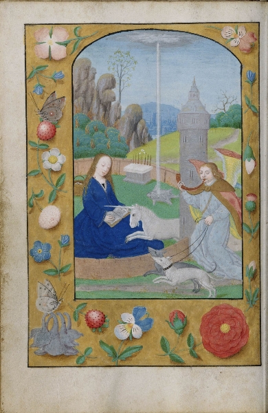
Flemish depictions of still lifes and flowers did not start in the 16th century. They date back to illuminated manuscripts like this Flemish Book of Hours with a page featuring flowers and butterflies and angels and the Virgin Mary on one page facing another page with a drawign of a strange battle between woodwoses and knights and other odd creatures.

#LevinaTerlinck
Levina Terlinck a Flemish miniaturist who moved to the English court of Elizabeth painted a large number of portraits of various courtiers but sadly many of them have been sad.
Yes thats why the image quality of this is a bit blurry Its a photo of a miniature which I have enlarged just a bit in an effort to give you some idea of the precision and detail of this work.
Note the fine composition.
Teerlinck is thought to have trained Hilliard. She was the daughter of noted illuminator Simon Bening.

And yes this is Mardy Sidney / Dudley Countess of Pembroke the writer and patroness of other writers.
SIMON BENING _MAI
#may #mai #illuminatedmanuscript #manuscript #simonbening #flemish #maying
There is a tradition or tropeor theme or whatever you want to call it of Illuminated Manuscripts featuring scenes of Early Summer "MAYING" excursions into the countryside to enjoy the pleasant spring weather and flowers and gathering branches for decorations.
This gouache watercolor is by Simon Bening a Flemish painter and while he has included aristocrats or townsmen on horse back holding branches they have gathered he has also featured a boatload of musicians and singers and captured the shimmer of sunlight on water!

I've posted a few times about Rufillus
#Rufillus #Scribe #illuminatedmanuscript

MORE RUFILLUS
#Rufillus #illuminatedmanuscript #portraits
Rufillus snuck a self portrait into another part of a text.
Enclosed within a letter D we see him either writing on a long piece of paper or possibly scraping and preparing a length of parchment.


#illumined letter #R #Rufillus #illimunedmanuscript
RUFILLUS ' R

Rufillus who if his self portrait is accurate was indeed a "little red", Rufillus being a form of Rufus, has used red and blue together to create the RE of what appears to the Latin word Regnan.
He has filled the top of the R with a beautiful knot pattern and a winged serpent that becomes a mans head carries our eye down into the rest of the text.
This image is also worth studying for showing us details of a scribe at work. We can see his pots of paint and stool and the artists reaching forward with a pan of red paint as if he is still painting the letter! Or is he telling us he also painted other things too?
#letter R #resurrection #illuminatedletter
R is for Resurrection
Since the dominant theme of the the posts for this blog is normally typography and lettering here for Easter is an example of the letter R used to frame an miniature image of the Resurrection.

#Altdorfer #resurrection
ALTDORFER'S RESURRECTION compared to others
THREE GERMAN PAINTINGS
You might want to compare this resurrection by Altdorfer to the depiction by Grunewald or Bouts!?


#Palm Sunday #2021 #lorenzetti #fresco
Some of you may have noticed I like to share famous works of art at Easter and Christmas.
Here's a famous Renaissance painting
Why did I pick this one to share.
I love the look on the donkeys face trying to figure out why its suddenly the centre of attention?
It also shows the importance of research. The painter had apparently seen palm leaves but not palm trees!

#teamtheotherguy
 |
| Copyright J. Vaux 2016 2021 |
It gives me great pleasure to announce that someone had the good taste to appreciate the ironic phrasing of the words in this design. Whoever your other guy is enjoy wearing this!
If you would like to see other typographic and letter based designs I have please visit RED BUBBLE

#pi #piday #march14
Today and tomorrow in other time zones is PI DAY - march 14 so

MENORAH MADE OF LETTERS
Alphabetic scripts are particularly good for shaping prose or poetry into patterns.
In this example the Hebrew script has had its letters arranged to shape a menorah a candlestick with branches. Think about whether you could do something similar with English?
 Think
Think
Pattern Poems are not unique to Herberts' Works but George Herbert created one of the best known examples.


