#autumn #frost #julievaux
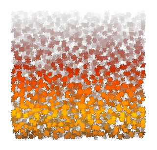
with this one I'm trying to express the idea that it's VERY late autumn and frost is here and the sky is chill and icy and the final fading and fall of leaves before winter has started.
Use it as a background for poems or lettering?
I may also put this up as a giveaway on my #Patreon page
www.patreon.com/JVartndesign
Wednesday 28 September 2016
Friday 23 September 2016
Color Drops
#colordrops #watercolor #redbubble Clothing
I've been working my way thru old scans looking for designs and photos that can be cropped and edited for the new #redbubble clothing products
Here's my latest upload! The link should lead you to a display on how it appears on an #ipad #case
http://www.redbubble.com/people/scholara/works/23189251-color-drops-a?p=ipad-case&rel=carousel
Enjoy
Tuesday 20 September 2016
XYZ NOT XXX
REAL ART IS XYZ NOT XXX
These are words I recently added to #stickers and other items on #redbubble
So what motivated this? Well checking out the Patreon Twitter feed sometime I see items described as "adult art" that are adult in the sense of being XXX and the posters claiming its was okay to post them cos they are erotic fantasy or erotic cosplay or whatever or its my private feed being another excuse when they tagged their art to appear in the twitter and patreon PUBLIC feed.
These are words I recently added to #stickers and other items on #redbubble
 |
| Copyright Julie Vaux 2016 |
So what motivated this? Well checking out the Patreon Twitter feed sometime I see items described as "adult art" that are adult in the sense of being XXX and the posters claiming its was okay to post them cos they are erotic fantasy or erotic cosplay or whatever or its my private feed being another excuse when they tagged their art to appear in the twitter and patreon PUBLIC feed.
Just tagging NSFW is NOT sufficient when your idea of adult art features the following whether a photograph video or drawing
the focus of an image is
a) cleavage b) oversized unnaturally large boobs gentilia or buttocks and I do mean UNNATURAL
if wearing clothes your model or character has an expression that suggests your target audience is clearly someone who doesnt date and sends too much time on in front of a screen and other stuff I can't say in public ...
other details make it quite clear you have interesting "issues" and fetishes TOO CLEAR and then there's the borderline rape fantasies ... though patreon seems to have finally blocked those ...
People I have no objections to nudity! I've worked as a life drawing model and see some wierd stuff over the years so please listen and don't label me a prude if I advise you to learn STYLE and DISCRETION and NOT showing everything all at once .... some of you clearly need to learn the difference between erotica and porn ... urgently ASAP ... and those of you "modelling" for webcams ... wear more makeup or use a soft focus on your face ... you're giving potential stalkers far too much information that could be used to track you in real life offline!
REAL ADULT ART is often mastering the XYZ co-ordinates if you're using a computer whatever your context or content.
Okay I've said my piece.
Friday 16 September 2016
LATE Autumn Gradient
First I was sick then I was offered a VERY short but FT contract for one week so I'm behind on posting!
Here's a gradient Background texture file for you to play with.
It was created in Inkscape and then exported as a png.
Here's a gradient Background texture file for you to play with.
It was created in Inkscape and then exported as a png.
I've tried to suggest LATE AUTUMN with a hint of frosty gray and very dark leaves mixed with fading leaves of red and brown and orange.
The fires of summer are fading to winter!
How did I do this? First make a square in red or brown
Add the leaves filter. Before or after the leaves filter create a gradient with multiple stops using the wheel or coding the colors whichever you prefer.
Its probably a good look to also use a filter that makes the edges of the square more rougher and assymmetrical like Torn Edges or Watercolor or both or not.
Your choice!
Friday 9 September 2016
Awesome Autumn
Every #autumn (southern and northern) I get tempted to make yet another attempt to craft the perfect gradient of colors and tones that reflects the transition of leaves from dark green to fading to brown. I managed to get 4 tones on this one. I hope they're visible on your browser. Once again I have uploaded and noticed another change I could have made ...more reds???
This was made with a Uncial font in #inkscape then a gradient added with 4 color stops then exported as a #png to be shared here.
Next time I'm trying for 6 color stops.
The other problem is size how to get the color stops in the gradient showing on a large and small scale. I'm sure I could get 6 colors on a tee print size logo but the PR web version might only show 2 or 3!
Enjoy and try the technique for your self.
Tuesday 6 September 2016
Spring is here!
Hello and I'm back from a medical break !
I'll try to can double or triple posts this week to make up for the hiatus!
And I'm pleased to only see one error I missed given the meds n my new inhaler seem to be effecting my eyes. First I'ld not read for long and now briefly I can manage without glasses ...though I shouldnt! Hence the break!
I'll try to can double or triple posts this week to make up for the hiatus!
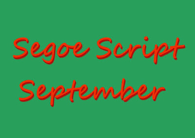
I suspect as the Segoe family comes with MS Windows pre installed ( well it was on my laptop) it may be at risk on becoming the new Comic Sans a perfectly fine font family that ends up becoming unpopular because people have either seen it too often or used it without giving it a few tweaks.
Personally I find for titles a few merged layers of drop shadow can be a great help. Yes thats all I did. Change the font color to red and add some drop shadow to one edge in #GIMP . Now its in a different browser I can see I could have moved over the start of September but the letter forms are crisp and clear and not too flat and should work for web or print page title letterheads or banners.
Not every act of typographic crafting has to be a museum quality collectible.
If I've made you think about Segoe Script and September it has performed its function: communication about clarity.
And I'm pleased to only see one error I missed given the meds n my new inhaler seem to be effecting my eyes. First I'ld not read for long and now briefly I can manage without glasses ...though I shouldnt! Hence the break!
Subscribe to:
Posts (Atom)


