Book of Hours Two
Gothic Script in context
I have wondered lately why most of the best illuminated manuscripts were produced in workshops in France and Flanders and i suspect the answer is WAR.
The Wars and Revolts in England and the Hundred years War between England and France was probably a factor.
England had thriving workshops in the 12th and 13th centuries and the major workshops in France and Flanders were not in areas effected directly by the wars.
Plus a book of hours was a small portable item easy to pack and move unlike a church fresco or mosaic or a stained glass window.
This particular Book of Hours was produced in Bruges which is now part of Belgium. The illumined sections are restrained and elegant.
Contrast this image with my previous post on the Bedford Hours.
This Book of Hours is called the Arnhem Book of hours.
Holland was still part of Flanders.
Note the use of white space in both books and the balance of the framing ornaments to the text sections and illustrations. Enjoy!
In the Next post I'll look at some French works.
Saturday 29 September 2012
Thursday 27 September 2012
Books of Hours One
Books of Hours
Gothic Script in Context
An illuminated Book of Hours was THE status item in the 14th and 15th centuries.
Many aristocrats and rulers delighted in commissioning and collecting them.
One of the most famous of them of that of the Duke of Bedford.
Gothic Script in Context
An illuminated Book of Hours was THE status item in the 14th and 15th centuries.
Many aristocrats and rulers delighted in commissioning and collecting them.
One of the most famous of them of that of the Duke of Bedford.
I've chosen these 2 pictures cos I hope they illustrate the following
1) The relationship of picture in text in illuminated manuscripts
2) the size of the originals
3) the use like modern web pages of framing to emphasize section
4) gothic script in its original context
Enjoy this and the next few posts in this series.
Tuesday 18 September 2012
Hello Visitors
Hello casual visitors and web searchers. A reminder!
I'ld love to have more followers! Bookmark my blog please? Thanx!
Thursday 13 September 2012
Inkscape Now Does Metallic
Inkscape's latest version includes filters for metallic SFX.
I've tested it for you ! Now go have fun playing with this yourself!
I've tested it for you ! Now go have fun playing with this yourself!
Monday 10 September 2012
Brush Work and Lettering
BRUSHWORK
And Lettering
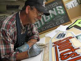
A few examples of lettering done with a brush not a pen.
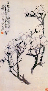
Arabic is usually written with a pen however in China they use brushes.
A close up of an asian style brush in use
but the angle and finger position actually isnt all that different from western brush lettering.
The major difference is the angle of the board
And Lettering
A few examples of lettering done with a brush not a pen.
Arabic is usually written with a pen however in China they use brushes.
a more typical use of chinese brushes
to shape strokes fine and broad for both letter shapes and the curves of the flowers
but the angle and finger position actually isnt all that different from western brush lettering.
The major difference is the angle of the board
Something to think about?
Has the use of a flat screen thats vertical effected modern lettering style and design and digital typography?
Thursday 6 September 2012
Monarchia A Review
I've been testing a freebie font I downloaded called Monarchia.
Here's an ABC sampler.
Here's an ABC sampler.
My opinion should be fun to use for drop caps and do experiment with adding color but the designer really should have used a more modern AS IN LEGIBLE form of the letters C W X and Z especially in the lower case.
So if you're typo designer or calligrapher enjoy using this sampler image as a starting point and see if you can come up with an improved version!
PLEASE!
Saturday 1 September 2012
A Brief History of Gothic Script
A Brief History of Gothic Script.
Gothic scripts derives from Caroline Minuscule which first appears in manuscripts of the 12th century.
The next stage seems to be Textura Quadrata used from 1200 to 1500 and named after the squared off four cornered letter shapes with a variant form called Quadrata prescisus vel sine pedibus.
Basically the same but no diamond points at the bottom of letters.
Then there's Quadrata minuscule from the end of the Middle ages and the more cursive Secretary hand used by scribes from the 13th to 17th centuries which has a modern simplified version.
Fraktur style Goth scripts and fonts date back to 1400 and are still in use today.
There's also Schwabacher and a French script called Batarde .
Rudolf Koch encouraged the revival of Gothic script with his modern Gothic minuscule script and Gothic Capitals and reworkings of several types of Gothic scripts into simpler elegant modern forms for calligraphy and typography.
Now I've given you lots of key words to use for your own research.
Enjoy looking for beautiful letter forms be they Gothic or other!
Subscribe to:
Posts (Atom)


