Sunday 31 March 2013
Easter 2013
Wishing you a joyous easter celebration with Grunewald's famous painting!
Google Isenheim Altarpiece for more info about this famous work.
Certianly the Altarpieceitself demos how graphic design is communication and story telling if you think of it as being an interactive narrative?
Sunday 24 March 2013
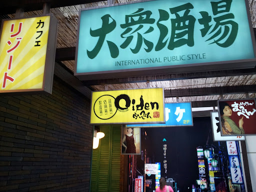
Ramen Shop Signage
This ramen n snacks shop creates a great atmosphere in a small space using spatial layout n signage n yes its in sydney

Thursday 21 March 2013
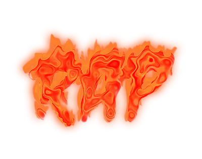
PLASMA RAP
 |
| Copyright Julie Vaux |
DANG I love this design but I don't think its workable or printable in its current state as I have an nasty and strong suspicion that although technically there's only two or three colors the swirly pattern might lead to bleeding in an actual print even a enlarged digital print using inkjet methods? Let alone silk screen printing 4 or 6 colors? Are the colors separable? Am I being too hestitant?
Ideas anyone?
Monday 18 March 2013
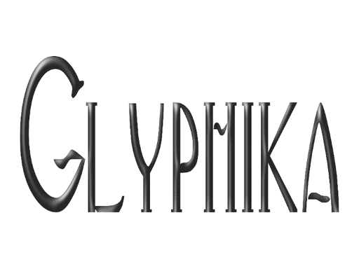
But I like playing with letters and why!
 |
| copyright julie vaux 2013 |
Some one was commenting negatively on my tee shirts designs though that person does seem to prefer mashup style tees anyway! This is my reply.
This blog is mostly about letters sometimes my typographic designs, sometimes other peoples, and sometimes I look at books and manuscripts and non roman scripts, and sometimes I just PR my own work.
I am not a brilliant typographer but I do like playing with letters and filter combinations in Inkscape and Gimp. Notice the word PLAYING.
I sometimes show the results of this playing and EXPERIMENTING cos I think the filter combos might give other people ideas for doing something better with the same techniques. That's called SHARING
Yes some of these results only work digitally but with more and more art work appearing in digital contexts ...
I don't mind if you're thinking I can do better ... but don't condemn my playfulness solely cos you have a strong preference for media mashups over other design styles.
Myself I'm hoping by accident or intent to create some letter art thats meaning with a message and also beautiful but sometiems I just play around and do do irony ... like my gibberish design on Red Bubble.
Finally did any of you notice technically I have not broken the stick to a few colors fonts rule?
Maybe I should make this a tee even if it only appeals to typographers and typophiles?
Friday 15 March 2013
Thursday 14 March 2013
Tuesday 12 March 2013
Monday 11 March 2013
Easter 2013 Design
 |
| Copyright Julie Vaux 2013 |
You can view and buy items with this design at www.cafepress.com/voxyvisions
Labels:
cafepess,
card,
design,
easter,
easter 2013,
gifts,
Julie Vaux
Friday 8 March 2013
Seahorse and Filters
Inkscape filters applied to the Seahorse from the Animals font.
Wednesday 6 March 2013
Animals font demo
Here's what the Animals font looks out at a larger size.
Yes I followed the qwerty keyboard.
Do visit the next post following this to see what happens if you add Inkscape filters to these.
Yes I followed the qwerty keyboard.
Do visit the next post following this to see what happens if you add Inkscape filters to these.
Friday 1 March 2013
EASTER 2013
 |
| Copyright Julie Vaux 2013 |
You can view this on tees clothings gifts, cards and other wonderful items at
oh and yes they do have a bunny toy !
Labels:
2013,
cafe press,
card,
cards,
christian,
clothing,
easter,
gifts,
holiday,
Julie Vaux,
typographic art
Subscribe to:
Posts (Atom)


