I'll try to can double or triple posts this week to make up for the hiatus!
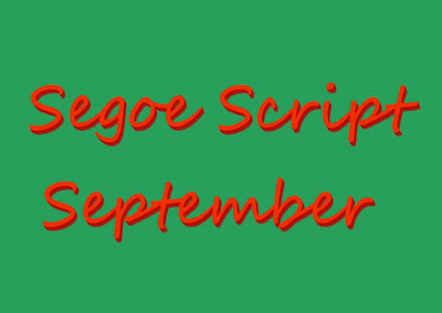
I suspect as the Segoe family comes with MS Windows pre installed ( well it was on my laptop) it may be at risk on becoming the new Comic Sans a perfectly fine font family that ends up becoming unpopular because people have either seen it too often or used it without giving it a few tweaks.
Personally I find for titles a few merged layers of drop shadow can be a great help. Yes thats all I did. Change the font color to red and add some drop shadow to one edge in #GIMP . Now its in a different browser I can see I could have moved over the start of September but the letter forms are crisp and clear and not too flat and should work for web or print page title letterheads or banners.
Not every act of typographic crafting has to be a museum quality collectible.
If I've made you think about Segoe Script and September it has performed its function: communication about clarity.
And I'm pleased to only see one error I missed given the meds n my new inhaler seem to be effecting my eyes. First I'ld not read for long and now briefly I can manage without glasses ...though I shouldnt! Hence the break!


No comments:
Post a Comment