Showing posts with label font. Show all posts

Tuesday, 10 November 2020

Martin of Tours and Carolingian Script

 #Stmartin #martinmas #carolingianscript 

Today is Martinmas November the 11th also Remembrance Day in several countries.

Now Martin of Tours was a Roman Soldier who became Bishop of Tours and one of the most famous examples of Carolingian Script is a manuscript with the biography of this saint written by Gregory of Tours. 


Excellent crisp letter forms of ink on parchment not paper showing why so called half uncial scripts were popular for so many centuries in Western Europe and still influence font design today.

Very obviously handwritten and not printed though with the spacing between words and letters and the size changing here and there as if the scribe hestitated thinking about how to fit the text onto the page.

Compare this to a Carolingian based font and consider the advantages of typography via a computer to the calligraghy of a scribe. 

Yet which was more personality or beauty ?


Friday, 18 January 2019

BEVEL DEMO

#inkscape #demo #bevel

INKSCAPE has a whole submenu under #Filter for Bevel

Here's a sampler


With some of these I would suggest duplicating the bottom text layer shown on the top line and then adding the Bevel filter to the duplicated layer or adding drop shadow in Inkscape or Gimp ?
Also avoid gradient fills and use heavier fonts and plain strong colors unless you're doing a really big  PRINT banner and have a very plain background?

Saturday, 7 July 2018

A Really Roman Alphabet 2

Yes this is Papyrus font but it happens to be the font closest in appearance to actual Roman hand written scripts for most of the letters. The Gs were shaped differently.


My suggestions would be if you are using this in an illustration to add more drop shadow and use a background layer with a paper texture to have it that ink on papyrus / parchment look.
If you're using it for a BIG header or title try adding a Torn filter as well.


Tuesday, 21 November 2017

Viner Hand Font Demo

#font #demo #inkscape #typography #VinerHand

This was created in Inkscape. I may do a further demo shwoing what this looks like with a stimulated paper texture added as a bottom layer. Don't forget if you're adding a layer in Inkscape or Gimp for a texture background to merge the layers and maybe add a little dropshadow to the layer with text and Transparent backgroundsfor the text layer until the final merge or export!


Tuesday, 13 June 2017

Edwardian versus Kunstler

Another comparision demo #inkscape #fonts #edwardian #kunstler
My comments below


Very very similar but I think the Edwardian works better than the Kunstler?

Both of them need clearer stronger Zs?


Tuesday, 28 February 2017

K.I.S.S. and Jokerman

Inkscape #jokerman #font #demo

What to do with all those ornamental Fonts that come with Windows 10?

Heres one demo of 2 simple edits


I am rather glad though there are few English words with J and F ? 
A bit more thought should have been given to the top cross bar in the J?


Friday, 5 August 2016

#question #questionsymbols #fonts 

For your Inspiration and Reference 
a collection of Examples of how various fonts represent question marks.


Friday, 18 March 2016

WHAT FONT to use for Easter Designs?

Hopefully we've all finished designs for whatever purpose but if you're stuck here's a font sampler with a few ideas !
I've given the name of the Font and an example of a typical Easter related word or phrase

#easter #font #design


drat I've just found Blogger will not display Old English despite Me inserting a png file ! 

Juice works surprisingly well
Irish Uncial probably needs some color?
Chancery Cursive that seems appropriate needs some kerning adjustments!?
Cardinal was also a pleasant surprise!

anyway hopefully this works as inspiration if only of the
 duh I can do better than that sort? 


Tuesday, 28 January 2014

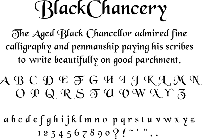
Black Chancery Demo


Here's a demo card for another freeware font I downloaded recently.
Enjoy and hopefully get some ideas for calligraphy or typography. 

Wednesday, 22 January 2014

Palatino Linotype Demo


Palatino Linotype is one of the classics at least for me.

Elegant yet strong and not as stark as ARIAL which I find too plain.

Don't overlook those fonts which come installed with the computer. Many of them are installed because they are reliable  standards.


Tuesday, 10 December 2013

Play with your letters

This is another just for fun post!

Or if you teach typography you might enjoy using this to test your first years ?


Can you name all the fonts and filters used? 

which letters are deliberately and slightly out of alignment?

Which had their nodes and paths tweaked to change the letter forms and where ?


Monday, 2 December 2013

FIGHT the tyranny of Arial

#Arial #font #typography

Some people love Arial I have mixed feelings about it which lead to a rather heated discussion on a forum and inspired this piece ... yes I suppose I'm being silly and yes this isn't a brilliant masterpiece of typography but it may amuse some people perhaps apart from me?


ENJOY and SHARE!

Support me via PayPal.me/JulieVaux 

Or PATREON PLEDGE ME


Wednesday, 28 August 2013

Fancy fabrics or why this blog is running late AGAIN


Fancy some fabric was created using Angelic War a font and this image is set to be larger than the original. I am STILL shudder Yes still sorting from my mother's room ... how one adult could squeeze so many fabric in a small space ... seriously it unpacked to more boxs than the bags it was in!

Anyway I'm going to be running Ads on Facebook and Gumtree for the next couple of weeks and if it doesnt sell its off to the salvos or op shop !

Now at the larger size some spacing errors that are NOT immediately obvious are showing so take and use this demo as a warning be extra careful with spacing and kerning if you're using Angelic War!

Wednesday, 15 May 2013

Rosetta Stone Font Test

If you are considering downloading Rosetta here's what the whole set looks like


Saturday, 17 November 2012

BE TEST


I've been testing one of my favorite decorative fonts again!

The word BE in Angelic War.

Every single one of these 8 variants were created in inkscape an open source SVG editor which has an option to bmp and png file format  files.


Have you tried Inkscape yet?

Tuesday, 14 August 2012

Pen and brush

PEN AND BRUSH
More samples to consider.

I created this image in Inkscape and then changed it to a png for uploading to the blog.


Ugh I left an I  out of handwriting.

Now consider this though the scribes who created the uncial forms that American Uncial is based on cut and used their pens or quills at a different angle to those who developed the Italic scripts elegant derives from.

An ACTUAL handwritten version of the Bradley hand example could vary in shape depending on whether it was written with a reed pen or quill or metal nib and whether the nib was square cut or round or cut at an angle.

Brushed font well a "DRY" brush effect not a fully loaded really wet brush

Segoe that looks rather similar to modern felt tip liner pens?

Try an experiment type the same word in several font types and then write the word on a variety of pens or brushes, reed, metal nib, felt tip pen, lettering brush.

The letter shapes will vary.

Try it!?