

A blog about Signs Fonts Typography Design Scripts Calligraphy Symbols etc,.
Wednesday, 25 July 2018
Reminder Time
Yes I have been adding up my annual income for my tax ... my "minor" income streams are NOT helping much and getting back to #typography what do you think of the use of the #Stencil #font for this ?


Sunday, 22 July 2018
Winter Logo and the Frost Filter
WINTER LOGO AND THE FROST FILTER
This #winter #logo is now up on my #deviantart and available as a free download
Show it as an example of the #inkscape #frost #filter
You are welcome to use it as a point of discussion or critique.
I'm still refining this technique myself.


This #winter #logo is now up on my #deviantart and available as a free download
Show it as an example of the #inkscape #frost #filter
You are welcome to use it as a point of discussion or critique.
I'm still refining this technique myself.

My observation. This would probably work best on a poster.
I started with a rectangle and added Torn Edges. I would suggest you also use Torn Edges or a Rough texture on the letters too. I made the letters a very pale blue since I knew I was adding Frost from an earlier test and the Frost filter was the last filter applied just to the layer with the letters.
Here's an earlier experiment in which I used gradient combined with a different filter in the first layer.
I was trying to suggest falling snow but it just made the bottom look uneven.

Just goes to show K.I.S.S. and the two / three color principles work!
Keep it simple and limit colors.
Wednesday, 18 July 2018
Two RUST LIKE FILTERS
#inkscape #filter #demo
Playing with Inkscape Again
 The bottom layer is a plain blue rectangle with no stroke and the Burst filter from the Textures applied.
I tried Burst for the Text but it broke up the edges too much.
Wanting something with a "rusty" look I applied Eroded Metal over a heavy font.
My suggestion for further experiments : maybe make the letters or foreground object a light or middle gray or yellowish brown color to emphasize the "METAL" and have a dark background or no background.
Enjoy
Playing with Inkscape Again

I tried Burst for the Text but it broke up the edges too much.
Wanting something with a "rusty" look I applied Eroded Metal over a heavy font.
My suggestion for further experiments : maybe make the letters or foreground object a light or middle gray or yellowish brown color to emphasize the "METAL" and have a dark background or no background.
Enjoy
Saturday, 14 July 2018
Joining J 2
#inkscape #j
JOINING J TWO
The week before I showed you the results of ab experiment with joining 2 overlappping letterforms into one vector svg object.

What came next? I added a top bar and having used fill and stroke node path and select all layers and checking that finally added just one Bevel filter

JOINING J TWO
The week before I showed you the results of ab experiment with joining 2 overlappping letterforms into one vector svg object.

What came next? I added a top bar and having used fill and stroke node path and select all layers and checking that finally added just one Bevel filter

I don't think I'ld be capable of doing this for a whole Alphabet but a Title or Header yes.
I hope this has given you some useful ideas.
Wednesday, 11 July 2018
Really Roman ABC Announcement
#roman #latin #abc #alphabet #deviantart
Okay I have fixed the layout bugs in both Roman ABCs and uploaded them to my DEVIANT ART
Please visit my DEVIANT ART GALLERY to get free downloads of this and other typography
and do consider a paypal donation?


These are PNGS with transperent backgrounds so you can edit them further. They are free to use but please let people know about the links or encourage them to follow the blog? Thank You
Okay I have fixed the layout bugs in both Roman ABCs and uploaded them to my DEVIANT ART
Please visit my DEVIANT ART GALLERY to get free downloads of this and other typography
and do consider a paypal donation?


These are PNGS with transperent backgrounds so you can edit them further. They are free to use but please let people know about the links or encourage them to follow the blog? Thank You
Saturday, 7 July 2018
A Really Roman Alphabet 2
Yes this is Papyrus font but it happens to be the font closest in appearance to actual Roman hand written scripts for most of the letters. The Gs were shaped differently.
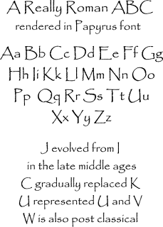

My suggestions would be if you are using this in an illustration to add more drop shadow and use a background layer with a paper texture to have it that ink on papyrus / parchment look.
If you're using it for a BIG header or title try adding a Torn filter as well.
Wednesday, 4 July 2018
A Really Roman Alphabet
A REALLY ROMAN ALPHABET
#roman #latin #typography #font
While we refer to our modern #alphabet as being "Roman" the actual alphabet the ANCIENT Romans used to write Latin looked more like this

#roman #latin #typography #font
While we refer to our modern #alphabet as being "Roman" the actual alphabet the ANCIENT Romans used to write Latin looked more like this

I have used #quadrata #font since it is very similar to the styles used on Roman inscriptions.
I may also put this up as an A4 pdf or png on my #deviantart for people to download for educational purposes after another edit. There's a kerning gap that needs a fix that shows in my Chrome browser but wasn't so obvious in Inkscape?
Subscribe to:
Posts (Atom)