Friday 26 August 2016

Greek Mosaic In Situ

I so fond see close up images of smaller details of #Greek #mosaics that it was a delight to find this image to share.


So why am I sharing it here rather than over on my #metousia blog?

Happily the photo angle and distance shows how greek mosaic artists were not just skilled craftsmen copying paintings but also designers who thought about layout detail composition and inserting lettering! So Glyphika is the place!

Who ever created this thought about color tone layout and the relationship of the mosaic to the rest of the room. Art Design Creativity. And the "classic" element that marks it as Greek /Hellenistic BALANCE.

Wednesday 24 August 2016

ONLY 100 and ONE Demo

Copyright Julie Vaux 2016
This PR image (more about that further down) was created using the #gimp #alienglow #filter over black letters. I selected yellow and black for the colors and the result ... no I didnt use Bevel or similar. Its mainly a tonal effect though I did do some cropping too.!

Hopefully it's striking and eyecatching as I need to remind people that if they shop on my #redbubble site AFTER 100 sales of EACH design I remove the image to increase its value for you by making it a limited edition.

Thats 100 sales regardless of whether the item is a sticker a print a duvet or a dress!


Friday 19 August 2016

A Vaughan Quote

#vaughan #quote #typography

Have you ever seen a closeup of pages of old 17th century books and noticed the slight bleed at the edge of letters. That's what I was aiming at .... a result that at least reminds you of 17th typefaces and its an interesting quote too.

!7th century English poetry is also something you should look at if you have access to editions that copy the original line layout  to see how they altered the indent of lines to emphasize the text and the line breaks and metre of a verse.


Copyright Julie Vaux work in progress 

I may redo this one more time and make the letters a little less rough or a different font?
Also remove my note about Vaughan and tweak the kerning?

Do read the whole poem if you can find it!

Tuesday 16 August 2016

NIGHT TO DAY

NIGHT TO DAY 
is my NEW #redbubble design #fashion #sydney #international

This link will take you to a page showing #clothing styles and other items

Julie Vaux on Red Bubble

Scroll down past the tee-shirt there should be other stuff below on show!


AUGUST PATREON SPECIAL

ALL OF AUGUST 
ALL PATREON REWARDS
JUST ONE DOLLAR


and I'll putting up multiple and mixed rewards every week so visit!!!

Saturday 13 August 2016

GIMP and Mosaic

#mosaic #gimp #filter

Gimp has a Mosaic filter I have experimented with now and then.

Here's two of my earliest attempts.

copyright Julie vaux 2016


For this one I added the lettering in a font I modified with more shadow to thicken the letters to look like a Roman uncial over a mosaic background.
Its just a bit too smooth ... another attempt

copyright julie vaux 2016

I wanted a mosaic background that emphasized the text so it stood out since this design was used on my Facebook page and the WEB.

This year however I decided to try to get both the background and lettering to work with the Mosaic filter. One tip: Add the mosaic filter LAST.

I wnated a background tonal range more like actual greek and roman mosaics ... so more matte and less shiny ...

copyright julie vaux 2016
unfinished work in progress 

still not quite right so color edits and border added 

another version  closer 

copyright julie vaux 2016
unfinished work in progress 


now the lettering looks much more like the irregular edges you see on ancient mosaics ... so theres about half a dozen merged layers in this 

I'll show you the finished final versions that will become stickers on Red Bubble next week! I may also put one up on Patreon as an reward or Deviant as an example.

A note on color edits - UP the both the yellows and reds but a touch more blue and cyan in the shadows. 

Resizing oddly with the mosaic filter to get it to work on a largely scale for a book cover I give found you have to work small and enlarge at the final edits otherwise the Mosaic effect just becomes a vague bumpy BG texture.

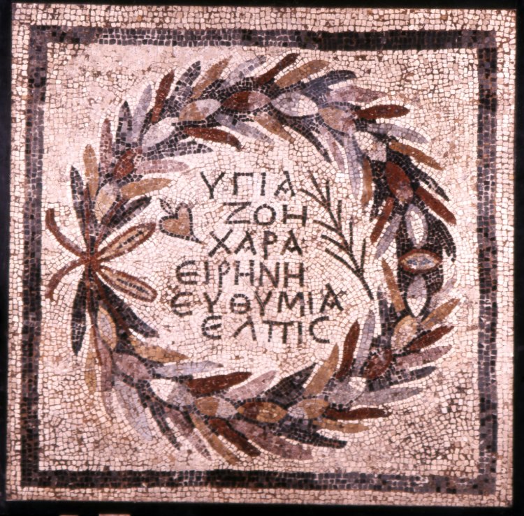
Now for a final comparison  a image of an actual mosaic  Roman Imperial era but Greek lettering!


 MMM next experiment I probably should try to see if Ripple might make the tile edges more irregular?  I have used ochre backgrounds rather than gray since I think it works better in a browser ....after all unlike the greeks I do not have a supply of marble chips and scraps or actual peebles! It needs to work for print and web so I can share it with you !

You can copy and share these images for educational purposes but not for resale !

Friday 12 August 2016

An Color Edit Example

Color Editing Mosaics.

I'll like you to help with a comparision.

The first image just had one simple crop and tidy up of edges.

The Second I did color and tone edits on to try to be back to how I suspect the original mosaic looked before weathering and erosion etc .


Is there a difference or not?

Here's the first version.


and now the second with more edits!


What do you think?

Next time I'll be discussing the use of mosaic filters in Gimp and how I edited letter shapes to get forms that would work the best with that filter.

Oh and yes I did tweak both the reds and blues for this using the Color Tool to deepen shadows and strengthen highlights and mid tones I HOPE ???


Friday 5 August 2016

#question #questionsymbols #fonts 

For your Inspiration and Reference 
a collection of Examples of how various fonts represent question marks.


Tuesday 2 August 2016

Sphinxes are NOT just from Egypt

#Sphinxes are not just from #Egypt

Craftsmen in the near East were also creating Sphinxes.

Yes they were influenced by Egyptian models but here's a couple of examples to help you with your own comparisons.


Please consider giving this blogger a little extra support via

PAYPAL

Adsense isn't paying me much.

P.S. what major difference from Egyptian art did you spot on two of the images?