Thursday 29 November 2012

Vespasian Psalter


The #Vespasian #Psalter is one of the oldest extant books with old English text.

The scribe who created this psalter or hymn book of Psalms added what are called interlinear glosses between the lines of Latin text.


Despite the Roman name this is an English illuminated manuscript probably created about 750 ad somewhere in Kent perhaps in a monastery in Canterbury?

The scribe has created a work both beautiful and functional limiting ornament to the titles and headers and writing the main body of text in a strong clear hand with well spaced lines.


Support me via PayPal.me/JulieVaux 


Or PATREON PLEDGE ME


Monday 26 November 2012

Japanese Typography Example - ZI


Is it just me or has anyone else noticed Japanese typographers whether they are working with romaji or kanji fonts use color more than the chinese?

This image is based on the character zi or ji in an archaic form but a fairly well known textbook anyone who's read up on the history and development of chinese characters would have come across.

Some of the most playful and bold  Japanese typography I've seen appears in anime opening titles.

I admire traditional calligraphy too but perhaps Asian typographers really need to get over the black can express the five colors cultural bias they learn in calligraphy classes or from doing sumi-e?

Characters can have color and not be folksy or vulgar!

Sunday 25 November 2012

SHARE


If you have enjoyed visiting Glyphika 
please consider following us and sharing this url on social media ?
Thank you.


Thursday 22 November 2012

Tuesday 20 November 2012

A Spiral was the start for this image!

A spiral generated by Inkscape was the start of this image.

Then I added a braided ring and joined those two objects.


Next step filters! The latest version of Inkscape has a filter called Dark edges  which I used over another called Felt. Have fun experimenting with these two to create your own texture effects!

Saturday 17 November 2012

BE TEST


I've been testing one of my favorite decorative fonts again!

The word BE in Angelic War.

Every single one of these 8 variants were created in inkscape an open source SVG editor which has an option to bmp and png file format  files.


Have you tried Inkscape yet?

Saturday 10 November 2012

More curvy hebrews!


More curvy hebrew!


Rashi which was originally developed for hand writing notes and commentaries is to my eye more elegant than the square forms. While both have been used as a basis for fonts I think Rashi is more calligraphic?

Thursday 8 November 2012

Curvy Hebrews!

CURVY HEBREWS!

Yes the Hebrew Script does have cursive forms!


Study this diagram and then visit the next post for more images.

Tuesday 6 November 2012

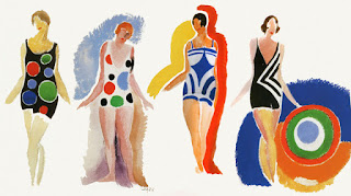
Sonia Delaunay Artists Are Designers

Sonia Delaunay was a painter and designer of fashion and textiles.


She  pioneered and supported the use of swimsuits with patterns.


but she was also a painter and a textiles designer!


You may have heard of her husband Robert Delaunay?

She cut back on her painting after ww1 to the 1960s cos of the need to support her family after her income from Russia was cut off by the Revolution.

Yes she was another one of those fabulous Russian Jewish artists / designers who moved to France or Germany first to study and then to settle.

Want to read more about her work ? Try this excellent book!


COLOR MOVES: ART AND FASHION BY
SONIA DELAUNAY 2011
matteo de Leeuw-de monti and petra timmers